Tuesday, 16 December 2014

Double-Page Spread Feedback

This is the feedback I received from my lecturer:


My lecturer advised me to:
  • Make the boxes around the questions smaller
  • Remove the photo credit rom the sub-image and add a caption instead
  • Fill the space at the bottom of the page by adding the masthead and issue number
  • Move the dominant image slightly to the left


I followed my lecturer's dvice tot he ebst of my ability. I removed the photo credit from the sub-image and added a caption, moved the dominant image to the left a little, made the boxes around the questions smaller, and added the masthead and issue number at the bottom of my page.


Monday, 15 December 2014

Contents feedback


This is the feedback I recieved fro my lecturer for my contents page. My lecturer advised me to:
  • Change the font of the essential information
  • Change the font of the sell-line
  • Move the social media icons
  • Add circles around the page numbers and chnage their colour
  • Change the model in the sub-images
  • Look at other magazines and their subscription puffs


I followed this advice to the best of my ability and circumstances. I changed the font of the essential information from Strong Glasgow to Ariel and made it smaller. I created a banner at the bottom of my page and moved the social media icons to there and added more information. I changed the font of the sell-line. I changed the colour of the page numbers and added coloured circles around them. I edited the subscription puff to make it look more professional.


Sunday, 14 December 2014

Front Cover Feedback


This is the feedback I recieved from my lecturer. My lecturer advised me to change the dominant image, change the colour of the sub-head, make the slogan smaller, enlarge the banner, and possibly change the font of the main sell-line and the masthead as well.


I followed the advice given to the best of my ability and circumstances. I made the slogan smaller and enlarged the banner. I chnaged the font and colour fo the main sell-line and changed the colour of the sub-head. The dominant image had a line through it (possibly from the effects and filters I had applied to it), so I had to remove it and use the original image with no filters or effects.


Wednesday, 10 December 2014

Double-Page Spread Comparison


Aims and Reflections- 10.12.2014

Today I aim to continue to update my double-page spread and upload the progress.

Reflection:

Today I have almost completed my double-page spread. I also compared it to an already existing page.

Monday, 8 December 2014

Aims and Reflections- 8.12.2014

Today I am to continue to update my double-page spread.

Reflection:

Today I continued to update my front cover, as planned.

Thursday, 4 December 2014

Article Attempt 2

This is my second attempt at writing an article. My peers told me to expand it further.

Wednesday, 3 December 2014

Double-Page Spread

1st attempt. I changed the background colour to be black, so it would match the genre conventions. I then added the dominant image and enlarged it so it would fill up one side of the page. Then I added the title and the sub-head.


2nd attempt. To make the page look more professional I added some slugs. I also changed the colour of the sub-head and added page numbers.


3rd attempt. I used the sharpen tool on the title to make it look more destroyed. I also used the inner shadow, drop shadow, stroke, and the bevel and emboss effects on it to mak eit stand out. Then I added the photo credit.


4th attempt. I started writing the article. To appeal to my target audience, I decided to have my article as a Q & A. The questions will be coloured white and the answers will be coloured red. This will make the answers stand out more. 


5th attempt. I slightly lightened the colour of the left page. I also added a coloured box around the question.


6th attempt. I added more questions (and coloured boxes around them) to the page. I will add answers to the questions later. I also used the drop shadow, inner shadow, and stroke effects on the coloured boxes. I used the burn tool around the masthead and the sub-head to make them stand out more.


7th attempt. I added the name of the author of the article (my name) and extra text to the puff.


8th attempt. I completed my article, though I had to remove one question as there wasn't enough room. I also had to move the puff. 


9th attempt. I wanted to add in a conclusion. However, there wasn't enough room. To make room, I made the sub-head and the article smaller and removed the first question. 


10th attempt. I realised that my page was not equally split in half, so I had the left side slightly to the left a little bit more. I also changed the conclusion a little.


This is the feedback I recieved from my classmates. They all advised me to make my text smaller and to add sub-images. 


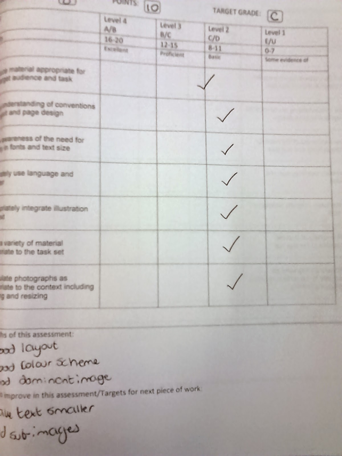
This is the grade and feedback I gave myself. I gave myself 10 points and a grade D.


11th attempt. I decided to follow my classmates' advice, so I made my text smaller and added a sub-image.


12th attempt. I didn't like the position of the sub-image, so I moved it. I also expanded my conclusion a little.


13th attempt. I changed the font and text of the masthead, slugs and page numbers. I removed the sub-image and the puff and changed the formation of the main body of text.

14th attempt. I changed the font of the masthead, added a pull quote, changed the sub-image and its heading, and added an introduction.


Monday, 1 December 2014

December Schedule

December Schedule

Contents Page Comparison

My product
Kerrang!


For my contents page I decided to use Kerrang! as my inspiration. I mimicked the layout, the use of a subscription box, the decision to organise the contents into types of articles rather than in typological order, and the inclusion of a sub-image.

Kerrang! has more sub-images than my page, and also has an editor's letter. My colour scheme is also more darker than Kerrang!'s, as I wanted to remain consistent with my cover and with genre conventions.

Today's aims- 1.12.2014

Today I am to complete my contents page,compare it to an existing contents page, and complete my image research for the double-page spread.

Wednesday, 26 November 2014

Aims and Reflections- 26.11.2014

Today I aim to continue to edit my contents page and start doing some image research for my double-page spread.

Reflection:

I have continued to update my contents page. I have also started the image research for my double-page research.

Wednesday, 19 November 2014

Reflection- 19.11.2014

Today I have edited my contents page and have recieved feedback for my front cover.

Tuesday, 18 November 2014

Contents Page

1st attempt. The dominant image was originally in colour, so I edited it to amke it balck and white, which matched the genre of music and would therefore appeal to the target audience. 


2nd attempt. I changed the layout of the text to make it more similar to the text layout of magazines. This meant I had to remove the sub-images. I also added a pull quote to attract the reader's attention.


3rd attempt. I have drastically changed the layout to make it more professional-looking. I changed the font of the title, added coloured boxes around the text, changed the colour of the text, and added a page number. I also edited the lighting on the dominant image to make the face of the model more attention-grabbing and visible.


4th attempt. I moved the masthead and essential information to above the dominant image. I added social media. I changed the coloured box around the text from red/black to grey and also used the burn tool on it. I then changed the colour of the text to make it easier to read and enlarged the image.


5th attempt. I added an image of the front cover and used the burn tool around it. I made the masthead and the pull quote larger and applied the burn tool further.


6th attempt. I felt that my contents page was too dark, so I changed the colour of the box around the text. I made the dominant image and the essential information smaller. I also moved the image of the front cover and added a sub-image.


7th attempt. I made my dominant image larger and changed the size of the pull quote. I also enlarged the coloured box and moved some text in order to fit in another sub-image. 

8th attempt. I removed the sub-images, as I felt that they made the page look too clustered. Removing the sub-images left me enough room to enlarge the front cover image and the 'subscribe' text. I moved the masthead and essential information to be below the dominant image. This allowed me to make the pull quote larger, move the social media logos, and make the masthead smaller.


9th attempt. I felt that the image made the page too dark, so I removed the lighting from it and made the image smaller. 


10th attempt. I felt that the page needed sub-images, so I made the masthead, essential information, and the pull quote smaller, and then moved them in order to leave some pace for the sub-images. I also made the social media icons smaller.


11th attempt. I made the sub-images smaller and moved them, as I felt that in their previous position they were either not visible enough or were taking the reader's attention off the dominant image. I also made the social media icons smaller and moved them, along with the pull quote.


12th attempt. I decided to add a coloured box around one of the sub-heads and a circle around the page number. I also removed some sub-images, make the text smaller, and add a frame around one of the sub-images.  


13th attempt. I added a coloured box around 'subscribe' in order to amke it stand out. I also used the burn tool aorund the text.


14th attempt. I made the 'subscribe' text and coloured box smaller. I also used the burn tool around the titles.


15th attempt. I added some more sub-images and frames around them.


This is the feedback I recieved form my classmates. Many of them liked the layout and the images. For improvement they said to make the text easier to read.


16th attempt. Based on my peer feedback, I decided to enlarge the text and remove the drop shadow effect to make it more visible. I changed the colour of the 'subscribe' text to red to make it stand out more. I made the coloured box around the lighter so the text will be easier to read. I also made the images larger. 


This is the feedback I gave myself.


17th attempt. I removed the sub-images, added more text, changed the font of the necessary information, and added shadows to the headings so they stand out more.


18th attempt. I added two sub-images.

19th attempt. I made the subscription box smaller, so the text next to it would not look too squeezed. This also allowed me to enlarge the bottom banner.