Today I aim to continue to edit my contents page and start doing some image research for my double-page spread.
Reflection:
I have continued to update my contents page. I have also started the image research for my double-page research.
Wednesday, 26 November 2014

Wednesday, 19 November 2014
Reflection- 19.11.2014
Today I have edited my contents page and have recieved feedback for my front cover.
Tuesday, 18 November 2014
Contents Page

1st attempt. The dominant image was originally in colour, so I edited it to amke it balck and white, which matched the genre of music and would therefore appeal to the target audience.
 2nd attempt. I changed the layout of the text to make it more similar to the text layout of magazines. This meant I had to remove the sub-images. I also added a pull quote to attract the reader's attention.
 3rd attempt. I have drastically changed the layout to make it more professional-looking. I changed the font of the title, added coloured boxes around the text, changed the colour of the text, and added a page number. I also edited the lighting on the dominant image to make the face of the model more attention-grabbing and visible.
 4th attempt. I moved the masthead and essential information to above the dominant image. I added social media. I changed the coloured box around the text from red/black to grey and also used the burn tool on it. I then changed the colour of the text to make it easier to read and enlarged the image.
 5th attempt. I added an image of the front cover and used the burn tool around it. I made the masthead and the pull quote larger and applied the burn tool further.
 6th attempt. I felt that my contents page was too dark, so I changed the colour of the box around the text. I made the dominant image and the essential information smaller. I also moved the image of the front cover and added a sub-image.

 8th attempt. I removed the sub-images, as I felt that they made the page look too clustered. Removing the sub-images left me enough room to enlarge the front cover image and the 'subscribe' text. I moved the masthead and essential information to be below the dominant image. This allowed me to make the pull quote larger, move the social media logos, and make the masthead smaller.

 10th attempt. I felt that the page needed sub-images, so I made the masthead, essential information, and the pull quote smaller, and then moved them in order to leave some pace for the sub-images. I also made the social media icons smaller.
 11th attempt. I made the sub-images smaller and moved them, as I felt that in their previous position they were either not visible enough or were taking the reader's attention off the dominant image. I also made the social media icons smaller and moved them, along with the pull quote.

 13th attempt. I added a coloured box around 'subscribe' in order to amke it stand out. I also used the burn tool aorund the text.


 This is the feedback I gave myself.


7th attempt. I made my dominant image larger and changed the size of the pull quote. I also enlarged the coloured box and moved some text in order to fit in another sub-image.


9th attempt. I felt that the image made the page too dark, so I removed the lighting from it and made the image smaller.


12th attempt. I decided to add a coloured box around one of the sub-heads and a circle around the page number. I also removed some sub-images, make the text smaller, and add a frame around one of the sub-images.


14th attempt. I made the 'subscribe' text and coloured box smaller. I also used the burn tool around the titles.

15th attempt. I added some more sub-images and frames around them.

This is the feedback I recieved form my classmates. Many of them liked the layout and the images. For improvement they said to make the text easier to read.

16th attempt. Based on my peer feedback, I decided to enlarge the text and remove the drop shadow effect to make it more visible. I changed the colour of the 'subscribe' text to red to make it stand out more. I made the coloured box around the lighter so the text will be easier to read. I also made the images larger.


17th attempt. I removed the sub-images, added more text, changed the font of the necessary information, and added shadows to the headings so they stand out more.

18th attempt. I added two sub-images.
19th attempt. I made the subscription box smaller, so the text next to it would not look too squeezed. This also allowed me to enlarge the bottom banner.
Monday, 17 November 2014

Today's aims- 17.11.2014
Today I aim to:
- Complete my front cover
- Upload completed attempt
- Compare it to an already existing cover and publish comparison
Wednesday, 12 November 2014
Aims and Reflections- 12.11.2014
Today I aim to continue to edit my front cover in preparation for when I acquire any images. I also intend to find an existing magazine to compare my front cover to and to hopefully replicate.
Reflection:
This lesson I have continued to edit my magazine. I have changed the effects and filters on my text and attempted to recreate an existing front cover. I have compared my attempt and the magazine I am recreating, which I will publish soon.
Reflection:
This lesson I have continued to edit my magazine. I have changed the effects and filters on my text and attempted to recreate an existing front cover. I have compared my attempt and the magazine I am recreating, which I will publish soon.
Wednesday, 5 November 2014
Front Cover
 |
| This is my first attempt at a front cover. |
 |
| 2nd attempt. I made the slogan smaller, adjusted the sub-head so it was more centralised, moved the essential information and added a banner. |
 |
| 3rd attempt. My lecturer said there was too much use of the colour white, so I changed the colour of some of the sell-lines to be red. I also used the noise effect on the main sell-line and its sub-head. |

4th attempt. I wasn't happy with the noise effect, so I discarded it and used the crack effect instead. I also made the red text brighter, as I felt it was too dark to read.

5th attempt. I wanted to recreate an existing magazine cover, so to do that I added boxes with text in instead of random floating text (as I had done in previous attempts). I also changed the font for the sub-head to Chinese Rocks so the main sell-line is more pronounced and eye-grabbing.

6th attempt. As you can see, I have added an image to my front cover! I also slightly edited the image to make it a bit darker.

This is the feedback I got from my classmates on my front cover. The majority of them have said to change the colour scheme, make the dominant image larger, add sub-images and to make the masthead bolder/larger.


7th attempt. I followed the advice of my peers and made the dominant image and the masthead larger. I also changed the colour of the sub-head.

This is the feedback I gave myself.

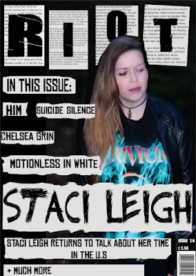


8th attempt. I changed the masthead to a word which I felt was more appropriate for my genre, as after some research I found out that the definition of 'zephyr' was a soft gentle breeze, which does not match the genre of rock/metal. Inspired by riot grrl zines, I decided to change the design of the page to make it look more DIY, so to achieve this I added boxes around the coverlines and coloured them off-white, as if they had been cut out from a newspaper. I changed the dominant image, as I felt that the previous one was not aesthetically pleasing.

9th attempt. I enlarged the image and edited it to change its colouring and make it look more aesthetically appealing. I used the eraser tool to erase the edges of some of the boxes, which made them looked ripped. I added text to the boxes around the masthead to further develop the DIY aesthetic.

10th attempt. I changed the colour of some of the cover-lines to make the page look less plain, and used the blending option to lower the opacity of some of the rectangles so that the masthead would stand out more. I also added more text to the banner.

11th attempt. I moved the dominant image into the centre and enlarged it so it was more eye-catching. I lowered the opacity of the boxes and added shadows to the text. Some of the cover-lines were removed and the remaining ones were moved to the side. I change the punctuation and colours of the text in the banner and added a circle with the price in it to attract my audience.

12th attempt. I moved some of the cover-lines, changed their colour and added sub-headings. I added a sub-image, removed the box around the main heading and moved the price back to being above the barcode.

13th attempt. I changed the dominant image and removed the sub-image as I felt that both were not appealing enough. After doing further research into colours and layout I changed the colour of the boxes and cover-lines, and I added other cover-lines. I changed the font of the masthead and main sell-line as well.

14th attempt. I changed the colour of the cover-lines, added an outer glow to the masthead to make it stand out more, changed the sub-heading and the font of the necessary information.

15th attempt. I decided that the masthead wasn't visible enough, so I used the paint tool to make it bolder and stand out more. I changed the colour of the main sell-line's sub-heading and its box to make it stand out and moved the necessary information.

16th attempt. I enlarged the necessary information and subsequently moved the cover-lines. I also used the camera raw filter on the dominant image to make it more aesthetically appealing.
Aims and Reflections- 5.11.2014
- Start work on my front cover, regardless of whether I have a image or not.
- Compare my attempt at a front cover with a magazine that has inspired me
Reflection:
I have started my front cover today and have edited it multiple times. I also started my comparison post, though I may edit that in the future. I am going to edit my front cover further.
Monday, 3 November 2014
Photoshoot
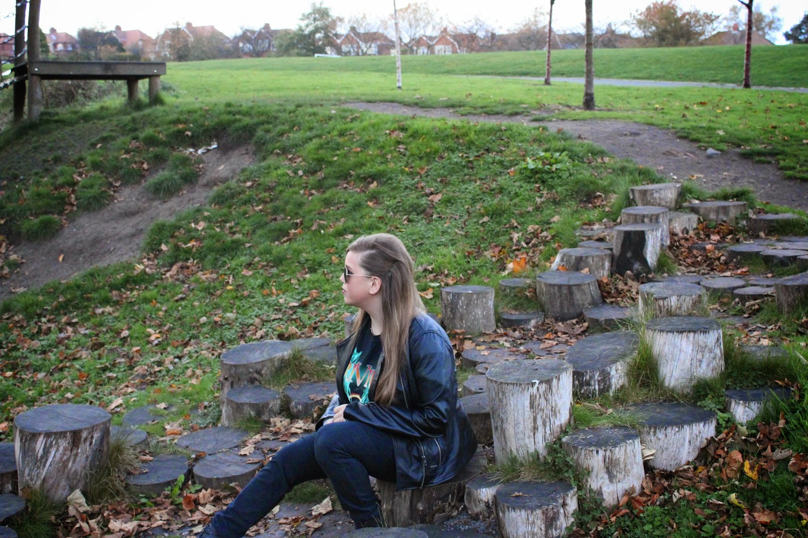
The photoshoot took place on Wednesday 29th October. However, when I was importing the images from the memory card to the iPhoto library the computer restarted itself without warning. When I logged back, all the images except for this one had been deleted. This means I must redo my photoshoot.
On November 18th I did my photoshoot. These are the images I collected from it:

Saturday, 1 November 2014
Subscribe to:
Posts (Atom)