
1st attempt. I changed the background colour to be black, so it would match the genre conventions. I then added the dominant image and enlarged it so it would fill up one side of the page. Then I added the title and the sub-head.
 2nd attempt. To make the page look more professional I added some slugs. I also changed the colour of the sub-head and added page numbers.
 3rd attempt. I used the sharpen tool on the title to make it look more destroyed. I also used the inner shadow, drop shadow, stroke, and the bevel and emboss effects on it to mak eit stand out. Then I added the photo credit.

 5th attempt. I slightly lightened the colour of the left page. I also added a coloured box around the question.
 6th attempt. I added more questions (and coloured boxes around them) to the page. I will add answers to the questions later. I also used the drop shadow, inner shadow, and stroke effects on the coloured boxes. I used the burn tool around the masthead and the sub-head to make them stand out more.
 7th attempt. I added the name of the author of the article (my name) and extra text to the puff.
 8th attempt. I completed my article, though I had to remove one question as there wasn't enough room. I also had to move the puff.
 9th attempt. I wanted to add in a conclusion. However, there wasn't enough room. To make room, I made the sub-head and the article smaller and removed the first question.
 10th attempt. I realised that my page was not equally split in half, so I had the left side slightly to the left a little bit more. I also changed the conclusion a little.
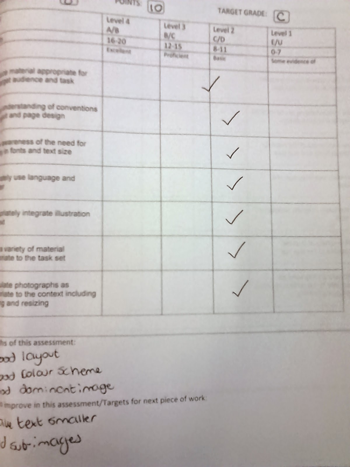
 This is the feedback I recieved from my classmates. They all advised me to make my text smaller and to add sub-images.

 12th attempt. I didn't like the position of the sub-image, so I moved it. I also expanded my conclusion a little.


4th attempt. I started writing the article. To appeal to my target audience, I decided to have my article as a Q & A. The questions will be coloured white and the answers will be coloured red. This will make the answers stand out more.


This is the grade and feedback I gave myself. I gave myself 10 points and a grade D.

11th attempt. I decided to follow my classmates' advice, so I made my text smaller and added a sub-image.


13th attempt. I changed the font and text of the masthead, slugs and page numbers. I removed the sub-image and the puff and changed the formation of the main body of text.

14th attempt. I changed the font of the masthead, added a pull quote, changed the sub-image and its heading, and added an introduction.

No comments:
Post a Comment