 |
| This is my first attempt at a front cover. |
 |
| 2nd attempt. I made the slogan smaller, adjusted the sub-head so it was more centralised, moved the essential information and added a banner. |
 |
| 3rd attempt. My lecturer said there was too much use of the colour white, so I changed the colour of some of the sell-lines to be red. I also used the noise effect on the main sell-line and its sub-head. |

4th attempt. I wasn't happy with the noise effect, so I discarded it and used the crack effect instead. I also made the red text brighter, as I felt it was too dark to read.

5th attempt. I wanted to recreate an existing magazine cover, so to do that I added boxes with text in instead of random floating text (as I had done in previous attempts). I also changed the font for the sub-head to Chinese Rocks so the main sell-line is more pronounced and eye-grabbing.

6th attempt. As you can see, I have added an image to my front cover! I also slightly edited the image to make it a bit darker.

This is the feedback I got from my classmates on my front cover. The majority of them have said to change the colour scheme, make the dominant image larger, add sub-images and to make the masthead bolder/larger.


7th attempt. I followed the advice of my peers and made the dominant image and the masthead larger. I also changed the colour of the sub-head.

This is the feedback I gave myself.

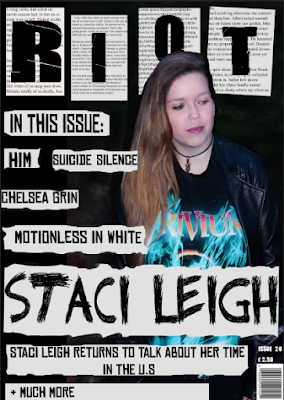


8th attempt. I changed the masthead to a word which I felt was more appropriate for my genre, as after some research I found out that the definition of 'zephyr' was a soft gentle breeze, which does not match the genre of rock/metal. Inspired by riot grrl zines, I decided to change the design of the page to make it look more DIY, so to achieve this I added boxes around the coverlines and coloured them off-white, as if they had been cut out from a newspaper. I changed the dominant image, as I felt that the previous one was not aesthetically pleasing.

9th attempt. I enlarged the image and edited it to change its colouring and make it look more aesthetically appealing. I used the eraser tool to erase the edges of some of the boxes, which made them looked ripped. I added text to the boxes around the masthead to further develop the DIY aesthetic.

10th attempt. I changed the colour of some of the cover-lines to make the page look less plain, and used the blending option to lower the opacity of some of the rectangles so that the masthead would stand out more. I also added more text to the banner.

11th attempt. I moved the dominant image into the centre and enlarged it so it was more eye-catching. I lowered the opacity of the boxes and added shadows to the text. Some of the cover-lines were removed and the remaining ones were moved to the side. I change the punctuation and colours of the text in the banner and added a circle with the price in it to attract my audience.

12th attempt. I moved some of the cover-lines, changed their colour and added sub-headings. I added a sub-image, removed the box around the main heading and moved the price back to being above the barcode.

13th attempt. I changed the dominant image and removed the sub-image as I felt that both were not appealing enough. After doing further research into colours and layout I changed the colour of the boxes and cover-lines, and I added other cover-lines. I changed the font of the masthead and main sell-line as well.

14th attempt. I changed the colour of the cover-lines, added an outer glow to the masthead to make it stand out more, changed the sub-heading and the font of the necessary information.

15th attempt. I decided that the masthead wasn't visible enough, so I used the paint tool to make it bolder and stand out more. I changed the colour of the main sell-line's sub-heading and its box to make it stand out and moved the necessary information.

16th attempt. I enlarged the necessary information and subsequently moved the cover-lines. I also used the camera raw filter on the dominant image to make it more aesthetically appealing.

No comments:
Post a Comment